One of my primary goals redesigning the Stone Soup website was to make the site feel more like a book. Stone Soup has long said that we show respect for our writer’s work through how we present that work but in reality that idea that through design one shows respect for the writing was limited to what we published on paper. In this website design I have applied the concepts of book typography to web pages.
The body text is set at the line length of a printed page — about thirteen words per line, much narrower than most websites. We use first-line indents (1.5em) to mark paragraph breaks, the way books do, rather than blank lines between paragraphs. We use small-caps headings tracked with letter-spacing, the way books do. Each page is set on a white “paper” centred on a linen-cream surround — the look of a book held open on a desk.
The proportions of the page itself follow classical book design: the inner gutter, the outer fore-edge, the head, and the foot are in ratios you can trace back to 17th and 18th century printers. The reading column never exceeds about 62rem at its widest — roughly the width of a hardback novel held in the hand.
Our hope is that when you arrive at a story or a poem, the visual register is the register of a book. You read, rather than scroll-and-scan.
The Typefaces
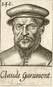
Cormorant Garamond, a Christian Thalmann font, based on the work of Claude Garamont (c. 1510 – 1561), a French font designer, known today as Claude Garamond. Cormorant Garamond sets the display titles you see at the top of every page and every piece of writing. Cormorant is unusual in the world of digital typefaces: Thalmann drew it with extremely fine, delicate strokes meant for large display sizes only. Our “Stone Soup” logotype and section titles are set in Cormorant at its lightest weight.
EB Garamond, Georg Duffner’s digital Garamond, carries the reading body — every story, poem, essay, memoir, and review on the site. The “EB” stands for Egenolff-Berner: Duffner’s digitization is based on a 1592 type specimen showing the work of Claude Garamont (c. 1510 – 1561), the sixteenth-century Parisian punchcutter whose roman face is the ancestor of nearly every Garamond [the modernized spelling of Garamont’s name] font you have ever read. We set EB Garamond at 18-pixel size with generous leading. It is one of the most historically faithful Garamond revivals available.
Source Sans 3, designed at Adobe by Paul D. Hunt, handles the small interface work: menus, buttons, labels, the chips you click to filter a listing. Source Sans was drawn specifically for screens and small sizes. We use it sparingly — only where it has functional work to do, never on body text.
Fira Sans, a sans serif font developed as a collaboration between Erik Spiekermann and Ralph du Carrois (originally for the web platform Mozilla), appears on our curriculum pages only — a clean, schoolroom-clear face for educational material.
All four typefaces are released under the SIL Open Font License, free for anyone to use. We chose freely-available faces over commercial ones partly on principle and partly because a small literary nonprofit ought to keep its public typography free. Cormorant, EB Garamond, Source Sans, and Fira Sans are all distributed without charge from within the Google Fonts family.
The Colors
The site uses a six-colour cycling palette we call the Orphist palette, after the early-twentieth-century art movement around Robert and Sonia Delaunay and František Kupka. Each successive story or poem on a listing page is given a different colour for its title: vivid orange, poetry blue, vivid purple, warm gold, emerald green, deep rose. Pieces do not have a single house colour by content type; they have a rotation by position, like the colour blocks in a Delaunay painting.
The brand colours — the teal “Stone” and the vermillion “Soup” — sit just outside the Orphist rotation.
The Medium
The site runs on WordPress with a custom theme we maintain ourselves. The theme has no build tooling, no JavaScript framework, no design system other than the principles above. Everything is written directly into hand-edited CSS files, meant to be read and modified by people rather than generated by machines. A future editor a decade from now should be able to open any file in the theme and understand what is going on.